Essential Flutter Widgets
Creating intricate and complex applications with Flutter can be tedious at times. However, through the use of Flutter’s collection of visual, structural, platform, and interactive widgets, this process can be expedited considerably.
In this article, we will introduce and explain five widgets that are essential components to any application.
1. BottomNavigationBar
The BottomNavigationBar widget is used to create a bottom navigation bar, which allows users to navigate between different sections of an application.
Usage
The BottomNavigationBar is typically used for apps with a small number of primary views that users need quick access to. It enhances user experience by providing a familiar navigation structure.
Additional Information
Pros:
- Provides an easy way to navigate between major sections of an app.
- Highly customizable with icons, labels, and styles.
- Can display badges to highlight new information or updates.
Cons:
- Can become cluttered if too many items are added.
- Not suitable for apps with fewer than three navigation destinations.
- Takes up screen space at the bottom, which might be an issue on small screens.
Use Cases:
- Social media apps (e.g., Instagram, Facebook) where users navigate between feeds, search, and profiles.
- E-commerce apps (e.g., Amazon, eBay) where users switch between home, categories, and account settings.
Code Example
import 'package:flutter/material.dart';

void main() => runApp(MyApp());

class MyApp extends StatelessWidget {
  @override
  Widget build(BuildContext context) {
    return MaterialApp(
      home: MyHomePage(),
    );
  }
}

class MyHomePage extends StatefulWidget {
  @override
  _MyHomePageState createState() => _MyHomePageState();
}

class _MyHomePageState extends State<MyHomePage> {
  int _currentIndex = 0;

  final List<Widget> _children = [
    HomeScreen(),
    SearchScreen(),
    ProfileScreen()
  ];

  void onTabTapped(int index) {
    setState(() {
      _currentIndex = index;
    });
  }

  @override
  Widget build(BuildContext context) {
    return Scaffold(
      appBar: AppBar(title: Text('BottomNavigationBar Example')),
      body: _children[_currentIndex],
      bottomNavigationBar: BottomNavigationBar(
        onTap: onTabTapped,
        currentIndex: _currentIndex,
        items: [
          BottomNavigationBarItem(
            icon: Icon(Icons.home),
            label: 'Home',
          ),
          BottomNavigationBarItem(
            icon: Icon(Icons.search),
            label: 'Search',
          ),
          BottomNavigationBarItem(
            icon: Icon(Icons.person),
            label: 'Profile',
          )
        ],
      ),
    );
  }
}

class HomeScreen extends StatelessWidget {
  @override
  Widget build(BuildContext context) {
    return Center(child: Text('Home Screen'));
  }
}

class SearchScreen extends StatelessWidget {
  @override
  Widget build(BuildContext context) {
    return Center(child: Text('Search Screen'));
  }
}

class ProfileScreen extends StatelessWidget {
  @override
  Widget build(BuildContext context) {
    return Center(child: Text('Profile Screen'));
  }
}
Rendered Example
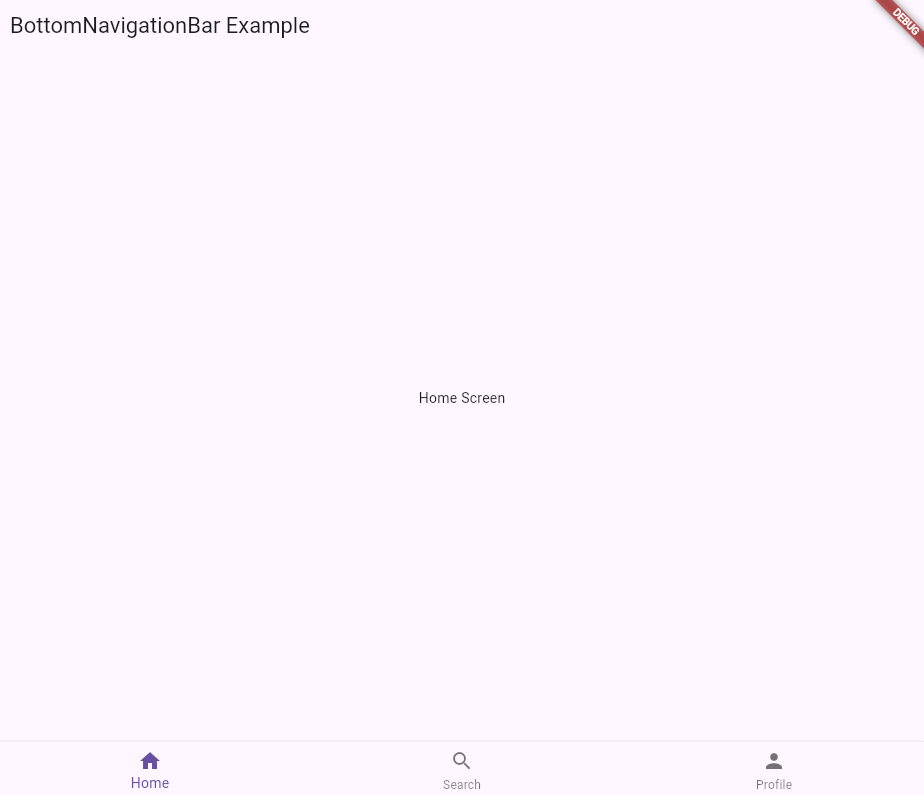
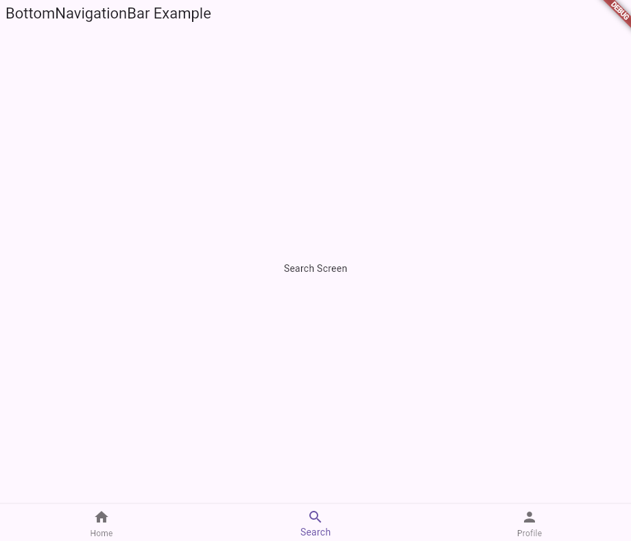
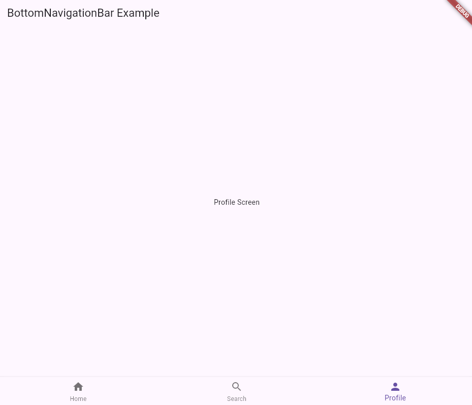
2. AlertDialog
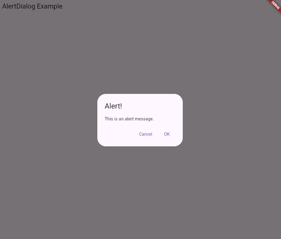
The AlertDialog widget is used to display a modal dialog with important information or actions that require user attention.
Usage
AlertDialog is often used for confirmation dialogs, error messages, or important information that needs user acknowledgment.
Additional Information
Pros:
- Useful for confirming user actions, such as deletions or sign-outs.
- Can display important messages or warnings that require immediate attention.
- Supports custom widgets for complex dialogs.
Cons:
- Interrupts the user flow and can be disruptive.
- Overuse can annoy users and lead to dismissal without reading.
Use Cases:
- Confirmation dialogs before performing irreversible actions, such as deleting an item.
- Displaying critical errors or warnings that need immediate acknowledgment.
- Requesting user input or decisions in multi-step processes.
Best Practices:
- Keep the message concise and clear.
- Use action buttons with descriptive labels (e.g., “Cancel” and “OK”).
- Avoid using too many dialogs to prevent user fatigue.
Code Example
import 'package:flutter/material.dart';

void main() => runApp(MyApp());

class MyApp extends StatelessWidget {
  @override
  Widget build(BuildContext context) {
    return MaterialApp(
      home: MyHomePage(),
    );
  }
}

class MyHomePage extends StatelessWidget {
  @override
  Widget build(BuildContext context) {
    return Scaffold(
      appBar: AppBar(title: Text('AlertDialog Example')),
      body: Center(
        child: ElevatedButton(
          child: Text('Show Alert'),
          onPressed: () {
            showDialog(
              context: context,
              builder: (BuildContext context) {
                return AlertDialog(
                  title: Text('Alert!'),
                  content: Text('This is an alert message.'),
                  actions: <Widget>[
                    TextButton(
                      child: Text('Cancel'),
                      onPressed: () {
                        Navigator.of(context).pop();
                      },
                    ),
                    TextButton(
                      child: Text('OK'),
                      onPressed: () {
                        Navigator.of(context).pop();
                      },
                    ),
                  ],
                );
              },
            );
          },
        ),
      ),
    );
  }
}
Rendered Example
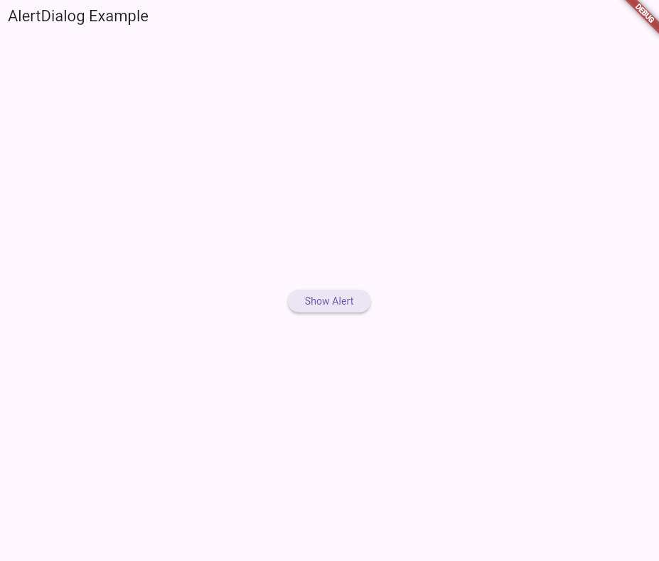
3. GestureDetector
The GestureDetector widget in Flutter is used to detect various gestures made by the user, such as taps, drags, and swipes. It provides an easy way to handle user interactions with UI elements without the need for complex event handling.
Usage
GestureDetector is typically used when you need to make a widget respond to user gestures. This can include detecting taps on buttons, swiping through lists, dragging items, or responding to double taps for zooming functionality.
Additional Information
Pros:
- Provides a simple way to handle a wide variety of gestures.
- Enhances user experience by making the app more interactive.
- Can be used with any widget, making it very flexible.
Cons:
- Handling complex gestures might require additional logic.
- Overuse can lead to a cluttered and hard-to-maintain codebase.
- Might need careful consideration to avoid conflicting gestures.
Use Cases:
- Implementing custom button actions by detecting taps or long presses.
- Creating swipeable cards or lists for navigation or actions.
- Drag-and-drop functionality for rearranging items within a list.
- Double-tap to like or zoom in on images.
Best Practices:
- Clearly indicate to the user that a gesture is expected, using visual cues or animations.
- Keep gesture handlers simple and focused on a single interaction to avoid confusion.
- Test gesture handling on different devices to ensure responsiveness and accuracy.
- Combine with other widgets like AnimatedContainer or Draggable for enhanced interactivity.
Code Example
import 'package:flutter/material.dart';
void main() => runApp(MyApp());
class MyApp extends StatelessWidget {
  @override
  Widget build(BuildContext context) {
    return MaterialApp(
      home: GestureDetectorExample(),
    );
  }
}

class GestureDetectorExample extends StatefulWidget {
  @override
  _GestureDetectorExampleState createState() => _GestureDetectorExampleState();
}

class _GestureDetectorExampleState extends State<GestureDetectorExample> {
  String _gestureDetected = 'No gesture detected';

  void _onTap() {
    setState(() {
      _gestureDetected = 'Tap detected';
    });
  }

  void _onDoubleTap() {
    setState(() {
      _gestureDetected = 'Double Tap detected';
    });
  }

  void _onLongPress() {
    setState(() {
      _gestureDetected = 'Long Press detected';
    });
  }

  @override
  Widget build(BuildContext context) {
    return Scaffold(
      appBar: AppBar(title: Text('GestureDetector Example')),
      body: Center(
        child: GestureDetector(
          onTap: _onTap,
          onDoubleTap: _onDoubleTap,
          onLongPress: _onLongPress,
          child: Container(
            width: 200,
            height: 200,
            decoration: BoxDecoration(
              color: Colors.blue,
              borderRadius: BorderRadius.circular(8.0),
              boxShadow: [
                BoxShadow(
                  color: Colors.black26,
                  offset: Offset(2, 2),
                  blurRadius: 4.0,
                ),
              ],
            ),
            child: Center(
              child: Text(
                _gestureDetected,
                textAlign: TextAlign.center,
                style: TextStyle(
                  color: Colors.white,
                  fontSize: 18,
                ),
              ),
            ),
          ),
        ),
      ),
    );
  }
}
Rendered Version
4. Drawer
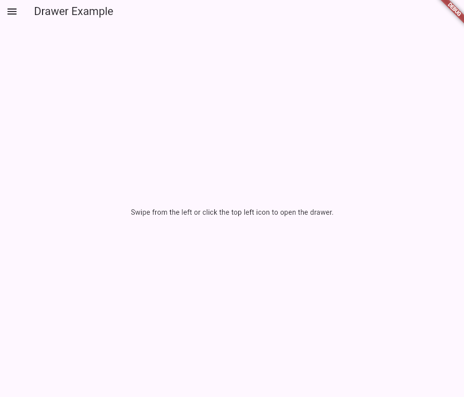
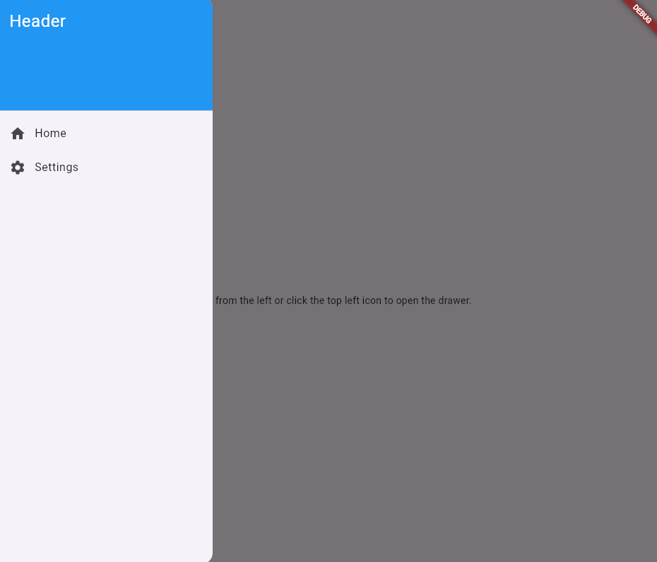
The Drawer widget is used to provide a sidebar menu which provides access to different sections of your application.
Usage
Drawer is essential in applications which have multiple sections and where navigation between sections is important.
Additional Information
Pros:
- Helps keep the main screen of the application uncluttered.
- Customizable as lists, buttons and icons can be added .
- Provides quick and easy access to other sections.
Cons:
- Gestures to open drawers can conflict with other gestures in the app
- Users may not view all sections of application
- Users with disabilities can find the drawer hard to access
Use Cases:
- To navigate between multiple pages (profile, messages) on a social media platform
- To change different settings for games (audio, display)
- To navigate between screens (cart, search, home) on E-commerce platforms
Best Practices:
- Ensure all items of drawer accessible, this can be achieved using the list tile widget.
- Avoid overloading drawer with items, keep essential items towards top of drawer.
Code Example
import 'package:flutter/material.dart';

void main() {
  runApp(MyApp());
}

class MyApp extends StatelessWidget {
  @override
  Widget build(BuildContext context) {
    return MaterialApp(
      home: MyHomePage(),
    );
  }
}

class MyHomePage extends StatelessWidget {
  @override
  Widget build(BuildContext context) {
    return Scaffold(
      appBar: AppBar(
        title: Text('Drawer Example'),
      ),
      drawer: Drawer(
        child: ListView(
          padding: EdgeInsets.zero,
          children: <Widget>[
            DrawerHeader(
              decoration: BoxDecoration(
                color: Colors.blue,
              ),
              child: Text(
                'Header',
                style: TextStyle(
                  color: Colors.white,
                  fontSize: 24,
                ),
              ),
            ),
            ListTile(
              leading: Icon(Icons.home),
              title: Text('Home'),
              onTap: () {
                // Handle navigation
              },
            ),
            ListTile(
              leading: Icon(Icons.settings),
              title: Text('Settings'),
              onTap: () {
                // Handle navigation
              },
            ),
          ],
        ),
      ),
      body: Center(
        child: Text('Swipe from the left or click the top left icon to open the drawer.'),
      ),
    );
  }
}
Rendered Example
5. ImagePicker
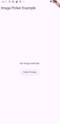
The ImagePicker widget is used to select images from a devices gallery or to capture images using the devices camera
Usage
ImagePicker is essential in applications which require user uploaded images. To use the ImagePicker, add the following code to the pubspec.yaml file and run the command flutter pub get.
dependencies:
  flutter:
    sdk: flutter
  image_picker: ^0.8.4+3
Additional Information
Pros:
- Provides an easy way to select images and videos
- Selected images can be previewed after selection
- Uses the native device interface for image selection and camera access
Cons:
- Camera and gallery access may need permissions based on the device
- Potential for errors such as unsupported file type and permission denial
- Can only select images, not files or documents
Use Cases:
- Uploading profile pictures for social media platforms
- Uploading pictures of documents for bank applications
- Selecting images of products to sell on E-commerce sites
Best Practices:
- Having a single button which leads to both options (Selecting images, camera) to avoid cluttering the screen
- Implement error handling with clear error messages for possible errors such as permission denial
- Show progress bars/indicators while uploading images and videos
Code Example
import 'package:flutter/material.dart';
import 'package:image_picker/image_picker.dart';
import 'dart:io';
import 'dart:async';
import 'package:flutter/services.dart'; // For handling permissions

void main() {
  runApp(MyApp());
}

class MyApp extends StatelessWidget {
  @override
  Widget build(BuildContext context) {
    return MaterialApp(
      home: ImagePickerExample(),
    );
  }
}

class ImagePickerExample extends StatefulWidget {
  @override
  _ImagePickerExampleState createState() => _ImagePickerExampleState();
}

class _ImagePickerExampleState extends State<ImagePickerExample> {
  final ImagePicker _picker = ImagePicker();
  File? _image;

  Future<void> _pickImage(ImageSource source) async {
    try {
      final pickedFile = await _picker.pickImage(source: source);
      if (pickedFile != null) {
        setState(() {
          _image = File(pickedFile.path);
        });
      }
    } on PlatformException catch (e) {
      _showError('Failed to pick image: $e');
    }
  }

  void _showError(String message) {
    ScaffoldMessenger.of(context).showSnackBar(SnackBar(content: Text(message)));
  }

  void _showPicker(BuildContext context) {
    showModalBottomSheet(
      context: context,
      builder: (BuildContext bc) {
        return SafeArea(
          child: Wrap(
            children: <Widget>[
              ListTile(
                leading: Icon(Icons.photo_library),
                title: Text('Photo Library'),
                onTap: () {
                  _pickImage(ImageSource.gallery);
                  Navigator.of(context).pop();
                },
              ),
              ListTile(
                leading: Icon(Icons.photo_camera),
                title: Text('Camera'),
                onTap: () {
                  _pickImage(ImageSource.camera);
                  Navigator.of(context).pop();
                },
              ),
            ],
          ),
        );
      },
    );
  }

  @override
  Widget build(BuildContext context) {
    return Scaffold(
      appBar: AppBar(
        title: Text('Image Picker Example'),
      ),
      body: Center(
        child: Column(
          mainAxisAlignment: MainAxisAlignment.center,
          children: <Widget>[
            _image == null
                ? Text('No image selected.')
                : Image.file(_image!),
            SizedBox(height: 20),
            ElevatedButton(
              onPressed: () => _showPicker(context),
              child: Text('Select Image'),
            ),
          ],
        ),
      ),
    );
  }
}
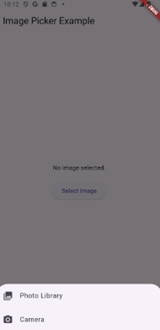
Rendered Version
To conclude, getting a handle on essential Flutter widgets like BottomNavigationBar, AlertDialog, GestureDetector, Drawer, and ImagePicker can really make your app development smoother and your apps more user-friendly. These widgets help you create easy navigation, interactive elements, and seamless media uploads. Whether you’re working on a big e-commerce site or a simple social media app, these tools will be your go-tos. So dive in, experiment, and watch your Flutter apps come to life with these handy widgets.
Happy coding!
— Sagar & Manu